Initially, I was somewhat resistant to these kinds of “phone-curing tools.”
Because I’ve tried so many methods: screen time, focus apps, the Pomodoro Technique, website blocking… but they all basically have the same ending—they work at first, then stop working.
So when I first saw Brick, my initial reaction was: “Just another reskinned self-control tool?” But after using it for about 30 days, my opinion completely changed.
First Impression: It’s Not Like a Tool, More Like a “Physical Switch”
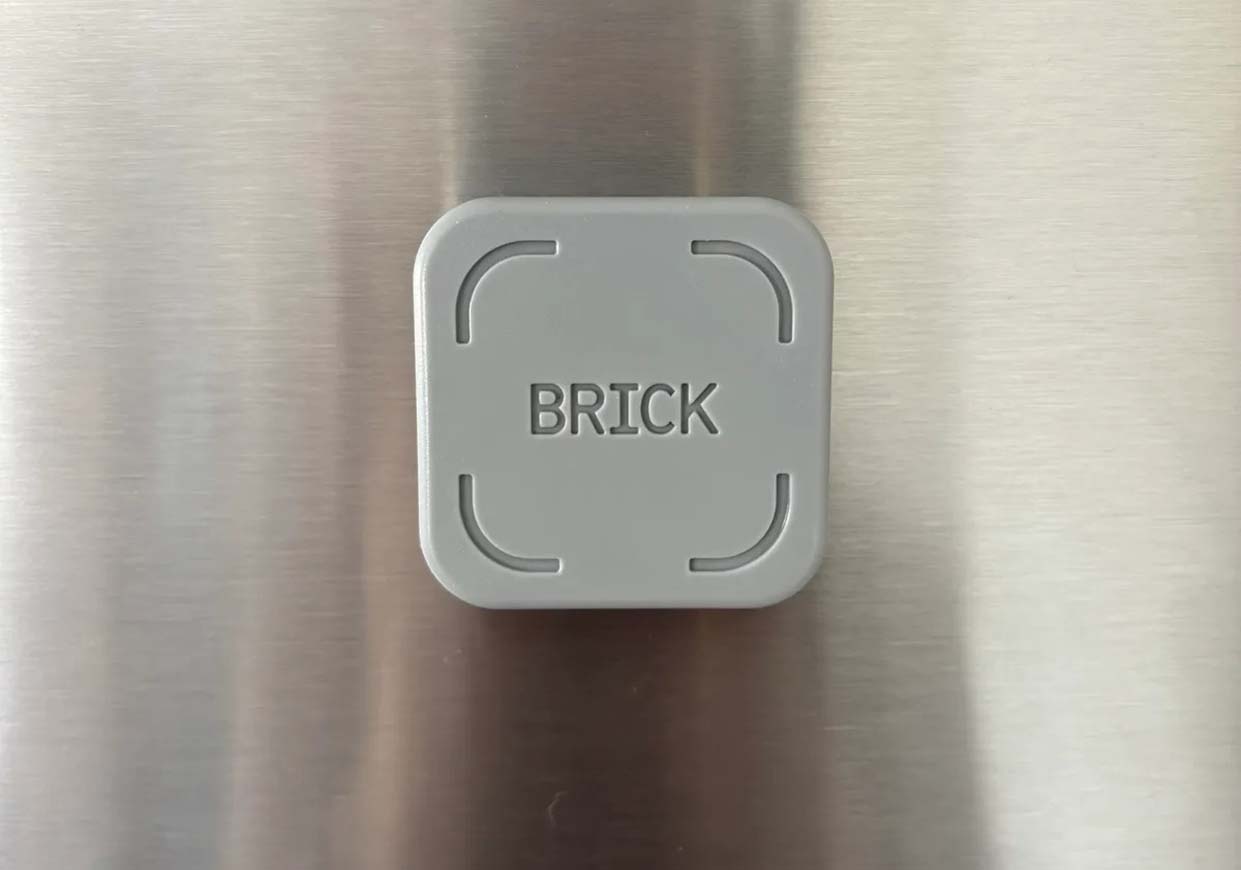
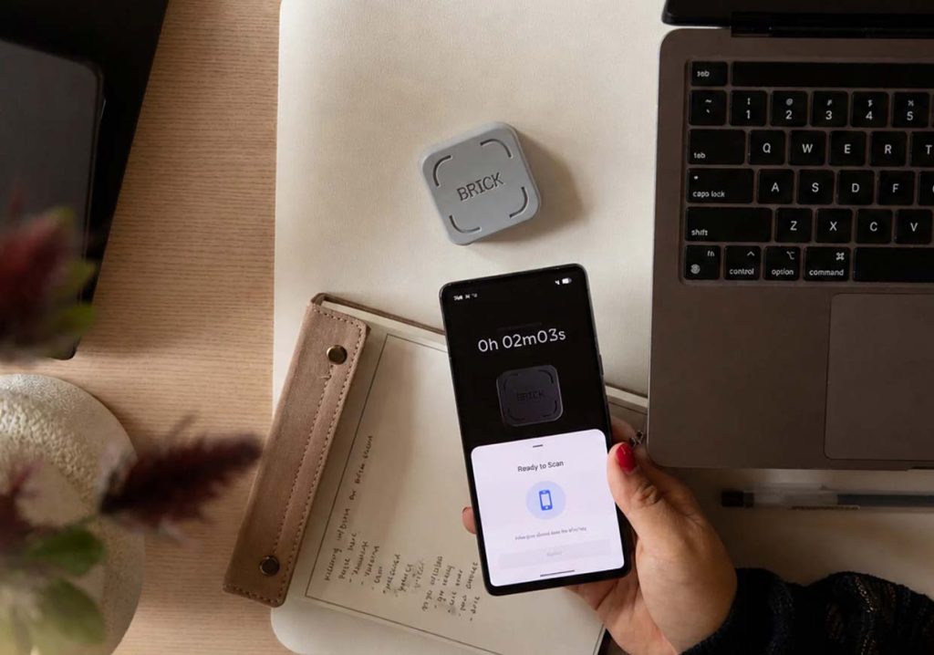
Brick itself is actually very simple, small enough to fit in the palm of your hand, and its appearance even has a “minimalist electronic accessory” feel. It has no screen, no complicated functions, and no distracting design elements.
What really caught my attention was its logic: using the phone is no longer about “opening an app,” but requires going through the physical device Brick.
In other words, it doesn’t restrict you, but rather transforms “using the phone” from a purely software operation into an action that requires physical participation. This is the key to the changes I experienced later.
Pairing and Setup: Simpler than I imagined, but with a very “rigid” logic
The first time I used it, what I did was actually very simple: open the app → connect to Brick → select a mode → complete the pairing. The whole process wasn’t complicated, even lighter than many smart devices.
But the really interesting part comes later. The Brick doesn’t just have a simple “on/off” function; it has a fairly complete system of usage modes. For example, there’s a work mode, a study mode, a sleep mode, a creation mode, and even a family mode.
Each mode corresponds to a different blocking strategy: which apps can be used and which websites will be restricted are all pre-set.
This made me realize that it doesn’t “help you ban your phone,” but rather helps you redefine “what your phone should do in different scenarios.”
Usage Process: What truly changed me was that one “physical action”
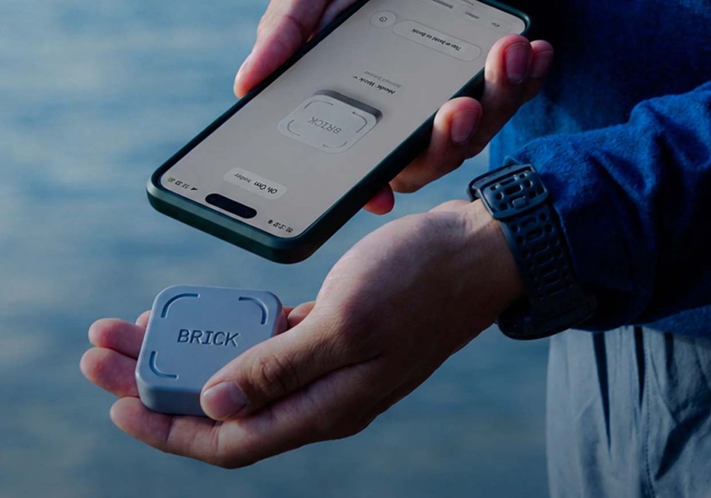
At first, when I used Brick, I didn’t think it was anything special. Until I started using it frequently.
Its process is fixed: Select mode → One-touch lock → Phone enters restricted state → One-touch unlock again after use.
At first, I thought it was just “one extra step.” But as I used it more, I realized the problem wasn’t the number of steps, but the “sense of interruption.” Previously, browsing my phone was seamless: unlock → open the app → keep browsing.
But now, every time I access my phone, I have to perform a physical action. This action seems small, but it disrupts the inertia of “automatic browsing.”
Many times, I just want to browse casually, but while “having to get Brick,” I stop and think: “Do I really need to use my phone right now?” Strangely, this question never arose before.
App Functionality Experience: Not Restriction, but Structured Use
Brick‘s app is more “systematic” than I expected.
Its core isn’t blocking, but “modes.”
I use the work mode and study mode the most. In work mode, I find that social media and short videos are almost completely isolated, but essential tools (such as maps, payments, and emails) are still available. The learning mode is even more rigorous, retaining almost only the basic functions.
More interestingly, it also has “emergency unlock attempts.” This design is actually quite realistic because it doesn’t pretend you can be 100% self-disciplined, but acknowledges that people have moments when they lose control. But the key is that this “loss of control” has a cost, not unlimited freedom.
Another feature that surprised me a bit is the statistics feature. It records your focus time in different modes, and this feedback allows you to see changes in your attention more intuitively, rather than remaining on vague judgments like “I feel like I wasted time today.”
Price and Purchase Experience: Counterintuitive Design of One-Time Payment
When I looked at the price on the official website, I hesitated a bit because it’s not a subscription, but a one-time purchase. In an era where almost all software is subscription-based, this model seems a bit “abnormal.”
But later I realized this was a plus. It means it doesn’t rely on continuous fees to maintain its existence, but is a tool that has already been designed. After purchase, it ships globally, and the overall process is straightforward, without complicated hidden fees.
Advantages: It solves a “behavioral problem,” not a “reminder problem”
After using it for about a month, I think its core advantages are threefold:
First, it’s almost impossible to bypass easily.
Unlike apps that can be uninstalled or settings that can be turned off, it requires physical intervention.
Second, there’s no pressure to subscribe continuously.
Use it when you’re done, without any psychological burden.
Third, it truly changes the behavioral path, rather than reminding you “not to scroll.”
This is crucial because many tools merely “remind you to restrain yourself,” while Brick “helps you slow down.”
My Real Change: Not that I stopped scrolling, but that I started to “realize that I was scrolling”
After 30 days of use, I haven’t become a “person who doesn’t scroll at all.”
But I’ve clearly become someone who “scrolls at their phone more slowly.”
Before: Want to scroll → Scroll directly
Now: Want to scroll → Need to go through an action → Pause → Decide again
This difference seems small, but it’s a qualitative change for attention. Because I’ve begun to regain “choice.”
Brick didn’t change the phone itself, but my relationship with it
Looking back now, I think the most important thing about Brick isn’t how complex its functions are, but that it changed one thing: I’m no longer someone who uses their phone unconsciously, but someone who is constantly making choices.
It didn’t distance me from my phone, but rather taught me how to use it again. That might be its true value.